Maps drawn level
The disc map on every flat-earth poster is a real projection, drawn by real cartographers for real work. Understanding what it preserves — and what it throws away — is the whole argument.
Two images do most of the work in this argument. On one side, a Mercator wall chart with Greenland the size of Africa. On the other, a circle with the north pole at the centre and the continents spread out around it. Each side treats the other's map as a distortion and its own as the plain truth. In fact both are projections, both are in legitimate professional use, and neither is a picture of the ground. That is worth stating carefully, because the mathematics here is not contested by anybody, and it is where the argument can actually be advanced or settled.
What a flat map is doing
A map is a flat sheet. Any flat sheet that shows a large part of a curved surface has to distort something. This is not a limitation of printing or of skill; it follows from the geometry. Four properties can be wanted from a map, and a single projection can hold at most some of them at once: correct distances, correct angles, correct areas, and correct shapes. Mercator preserves angles and shapes locally and inflates area badly towards the poles. Equal-area projections such as Lambert azimuthal equal-area keep areas and wreck shapes. The gnomonic projection shows every great circle as a straight line, which is why it is used to plan long flights, but it cannot show more than a hemisphere at once. Choosing the projection is choosing which lie to tell.
No flat map of a sphere can preserve distance, angle and area simultaneously. Every projection is a deliberate compromise, and a competent cartographer states which compromise they have made. This much is ordinary map theory and is taught in every surveying course.
The azimuthal equidistant projection
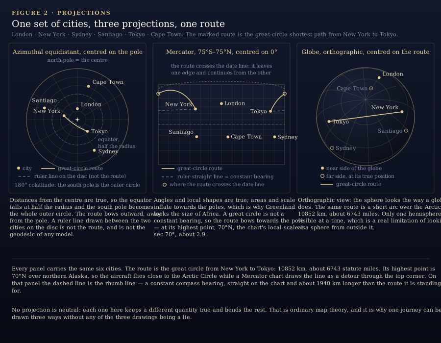
The projection that matters here is the azimuthal equidistant projection, often abbreviated AED. Pick a centre point — for the maps under discussion, the north pole. A point on the map is placed at a distance from the centre that is exactly proportional to the true distance along the surface from the pole, and at the true compass bearing from the pole. Distances measured from the centre are therefore correct, and bearings from the centre are correct. Everything else degrades as you move outward: scale is true only at the centre, shapes stretch the further out you go, and areas near the rim are enormously exaggerated. On a whole-world AED centred on the pole, the antipode of the centre — the south pole — becomes the outer circle, and because the pole-to-equator distance is half the pole-to-pole distance, the equator falls exactly halfway along the radius.
This is ordinary, useful cartography. Polar research charts use it because bearings from the pole are what a field party needs. Radio operators use it because a great-circle path from one station plots as a straight line from the centre, which makes propagation look simple. Aviation planning charts use it in the same way. And the emblem of the United Nations, approved by General Assembly resolution 92 (I) of 7 December 1946, is an azimuthal equidistant projection of the world centred on the north pole, drawn out to 60 degrees south latitude inside a wreath of olive branches. Nobody designed the UN emblem to make a point about the shape of the earth.
The Gleason map
The disc map sold as flat-earth proof has a documented history. Gleason's New Standard Map of the World was published in 1892 in Buffalo, New York, by Alexander Gleason, and its own imprint credits the projection to J. S. Christopher of Blackheath, England. It is a north-polar azimuthal equidistant map with an overlay — a movable arm — for reading off time and longitude in different places. Gleason patented the design, and its stated purpose was calculation: you trace the arm around the dial and read clock time and date around the world. Its promotional subtitle claims it is “scientifically and practically correct; as ‘it is’”, which is printer's blurb, not a geodesy result.
So the most recognisable flat-earth image in existence began as a time-keeping aid from a nineteenth-century American printing house, drawn in the projection established cartographers were already using. It later became the default illustration of the flat model — largely, it seems, because a disc with the pole at the centre looks like a disc with the pole at the centre. That is an argument from appearance, and it is worth noticing that the globe side can make the identical move by pointing at a globe.
Geodesy treats the AED disc as one useful projection among many, with a stated centre and a stated set of correct quantities. On that reading the disc is not evidence of anything beyond its own construction: it is a flat picture of a spheroid, made by flattening a spheroid, and the flattening is where all the distortion lives.
Why the flight paths look the way they do
Here is the part that carries real weight, and it is a fact about the shape of the surface, not about politics. On a sphere, the shortest surface path between two points is the arc of a great circle — a circle whose plane passes through the centre. On a Mercator chart, a great circle almost never looks straight; it bows towards the pole. That is why the line from Los Angeles to Tokyo on a wall chart seems to bend up through Alaska, and why the aircraft really does fly close to the Aleutians. On a globe, that route is short and the Mercator curve is the distortion. On a gnomonic chart the same route draws as a straight line, which is exactly why navigators use gnomonic charts for long legs and Mercator charts near the destination.
Now put the same routes on the north-polar AED disc. A route between two northern points that runs near the pole will look short and direct, because the disc keeps distances from the centre honest. A route between two southern points — Johannesburg to Sydney, or Santiago to Sydney — has to be drawn across the outer part of the disc, and the distances read off it are enormous. Flight times published for those routes are long, and flat-earth sources point at the two facts together: the disc shows a huge distance, the timetable shows a long flight. On the globe reading, those southern routes are short great circles that swing far south, near Antarctica, and the disc is the wrong measuring instrument for them because the AED stretches exactly that region.
Both sides agree that great-circle routes are shortest on a sphere and that the AED distorts the southern hemisphere. They disagree about which description the ground obeys. The way out is not to argue about the poster but to compare published distances and block times against each model's predicted values for the same city pairs — which is what Try it yourself sets out to do, and what the counter-arguments on Objections, answered press hardest on.
How a map choice shapes the argument
Three lessons fall out of the projection mathematics, and they cut in both directions.
- A straight line ruled on the AED disc between two non-central points is not, in general, the geodesic of any model. It is a chord on a distorted sheet. Arguments that treat that ruled line as the “correct” route are arguing from the artefact.
- Choosing the centre of an AED decides the result before any measurement is made. Centre the projection on your own city and your own city's distances come out true. Centre it on the pole and the whole southern hemisphere comes out stretched.
- No map is neutral. Both the Mercator wall chart and the Gleason disc are drawings made for a purpose; the honest question is not which drawing is true but which measured quantity — distance, bearing, flight time, survey baseline — the drawing claims to represent.
The same caution applies to the site's own diagrams. Anything we draw on this site is a projection too, and we will say which one. Where a number is quoted, the source is named so it can be checked against the airline, the survey office or the atlas it came from.
The map question is really the firmament question in another form — whether the sky is a closed structure or an open one. The firmament page covers the textual history, the model page covers the geometry the disc is meant to represent, and the glossary defines every term used above.
This page presents the flat-earth interpretation as its subject matter. It is a belief-based reading of the observations, not a scientific finding — see About for how we frame claims and for the mainstream sources.